


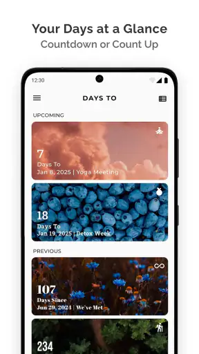
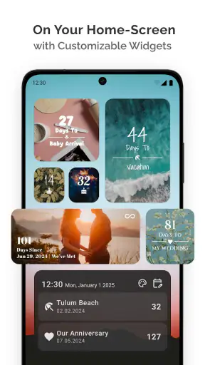

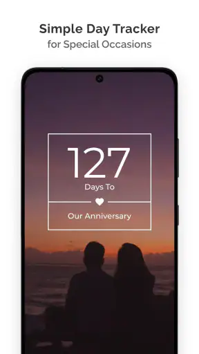

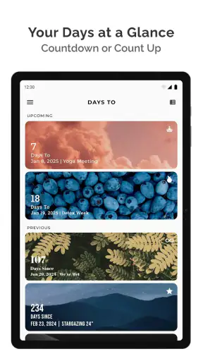
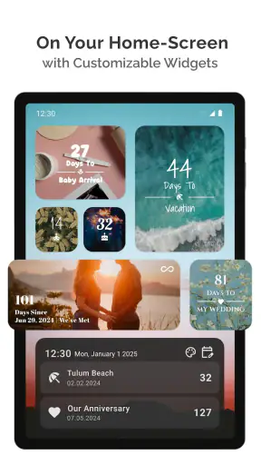

I like small apps that solve one annoying problem without trying to become a complete personal assistant. Days To takes that approach: it gives important dates a visible countdown so I can see how close an event is instead of relying on memory or digging through a calendar. After using it as a lifestyle app, I found it most useful for birthdays, trips, appointments, renewals, exams, celebrations, and any other date where “sometime next month” is not precise enough.
The basic idea is easy to understand, but the value depends on how deliberately you set it up. If I add every minor task, the list quickly becomes noisy. If I reserve it for dates that deserve a visual reminder, the app becomes a calm little reference point. That distinction is important: this is not a replacement for a full calendar, and I would not treat it as one. It is better understood as a focused countdown board for events I want to keep in sight.
How I use the countdown workflow
My usual starting point is to create only the events I genuinely care about. A birthday, a planned holiday, a wedding, a concert, or the end of a subscription period makes sense. A routine errand that belongs on a daily task list does not. This simple filter keeps the main view meaningful and prevents the app from turning into another crowded planning tool.
Once an event is entered, the countdown gives it a more immediate feeling than a standard calendar entry. A calendar tells me where an event sits in a month; a countdown answers the question I usually have in everyday life: how long until it happens? That difference is especially useful for occasions that are emotionally important or require preparation over time.
A realistic example is planning a family visit. I can add the visit as a date to watch, then use the remaining time to decide when to book transport, buy a gift, or arrange time away from work. The app does not perform those tasks for me, but it keeps the deadline visible enough to support that routine. I prefer this separation because it avoids pretending that one simple tool can replace notes, calendars, reminders, and task management all at once.
The strongest workflow is therefore a two-part system. I use a normal calendar for appointments with a specific time, location, or invitation, while I use this app for dates I want to feel as a countdown. That combination is more practical than forcing every event into one place. If I need alerts, detailed scheduling, shared calendars, or complex recurrence rules, my regular calendar remains the better home.
For first-time setup, I recommend entering a small group of dates rather than importing or recreating an entire history of events. The goal is to learn how the display fits your habits. After a few days, it becomes clearer which events deserve permanent attention and which ones only seemed important during setup.
Choosing events that benefit from a countdown
Not every date feels better when expressed as a number. A countdown works well when anticipation matters or when preparation should begin before the day arrives. A vacation, a personal milestone, a school deadline, or a recurring celebration can all benefit from that visual pressure. By contrast, a medical appointment or a meeting may be better handled by a calendar notification because the exact time is more important than the number of days remaining.
I also find it useful for dates that are easy to overlook because they are far away. When an event is several weeks ahead, it can disappear from a normal mental schedule. Seeing it regularly encourages earlier action without requiring a complicated planning system. This is one of the app’s quiet strengths: it turns distant dates into something I can understand at a glance.
There is a trade-off, though. A countdown can create urgency even when urgency is not helpful. If I place too many future events in front of myself, the screen starts to feel like a list of obligations. I get better results by keeping only the dates that deserve repeated visual attention and leaving ordinary commitments in the tools designed for them.
Settings and presentation choices worth checking
The most useful setup decisions are the ones that make the countdown readable and emotionally appropriate. I pay attention to the way an event is named because a short, recognizable label is faster to scan than a sentence full of details. “Dad’s birthday” works better for me than a long description containing information I already know.
I also think about whether an event is a one-time occasion or something that returns. Birthdays and anniversaries naturally lend themselves to repeatable yearly habits, while a one-off trip or appointment should be treated differently. Before saving an event, I check the date carefully and consider whether I want to keep it visible after it has passed. This small review step prevents old occasions from quietly cluttering the list.
Because the current release is version 6.1.1, I would still look through the available display and event options on the device rather than assuming that every setting behaves exactly like another countdown app. Interfaces change over time, and the sensible approach is to test one event first. That lets me confirm how the app presents the remaining time and whether the chosen arrangement matches my routine before I build a larger collection.
The app is free to install, which makes experimentation easy. It also includes optional in-app purchases ranging from $1.99 to $9.99 per item. I would start with the free experience and decide only after using it for real events whether any paid option improves the way I organize dates. A countdown tool should earn that upgrade through daily usefulness, not through pressure to customize everything immediately.
One setting habit I recommend is reviewing the list at the beginning of each month. I remove events that no longer matter, correct dates that were entered as temporary placeholders, and add the next genuinely important occasion. This monthly reset is more effective than constantly editing the app because it gives the countdown list a clear purpose and reduces maintenance.
Faster patterns for people who use it often
Experienced use is less about entering dates quickly and more about creating a repeatable rule for what belongs there. My rule is simple: if I would be disappointed to forget the date, or if I need to prepare for it gradually, it deserves consideration. That rule makes adding an event faster because I am not debating every ordinary appointment.
I also group my thinking by time horizon. Near events are useful for immediate preparation, while distant events are useful for long-term awareness. I avoid filling the app with every date in between. This keeps the countdown view from becoming a second calendar and makes the remaining figures easier to interpret.
Another useful pattern is pairing each important countdown with one action outside the app. For a trip, that might be checking documents. For a birthday, it might be choosing a gift. For an exam, it might be setting up a study plan. The countdown itself is not the plan; it is the trigger that tells me when to revisit the plan. Treating it this way prevents a common mistake: expecting a date display to manage all the work surrounding an event.
For recurring occasions, I would enter the next occurrence only when I am ready to think about it. That keeps the list focused and avoids a wall of repeated events. Once the occasion has passed, I can decide whether it still deserves a place in the next cycle. This approach is particularly helpful for people who enjoy countdowns but dislike maintaining a large archive.
Short labels are another practical advantage. When I glance at the app, I want to recognize an event instantly. I keep extra context in my calendar or notes and let this app handle the emotional headline: what is coming, and how close is it? That division makes the countdown screen more useful without asking it to store information it was not designed to manage.
Where it fits beside calendars and reminder apps
Compared with a standard calendar, this app feels more focused and less administrative. A calendar is excellent for schedules, overlapping appointments, invitations, time zones, and detailed event information. Days To is more appealing when the main question is simply how far away a meaningful date is. The two tools complement each other rather than compete directly.
Compared with a task manager, the difference is even clearer. A task manager tells me what to do next and may track completion, while a countdown gives an event emotional and temporal visibility. If I need checklists, priorities, dependencies, or work assignments, I would choose a task app. If I need a clean reminder that a special day is approaching, this app is the more pleasant choice.
It also differs from relying on memory or a note pinned somewhere. A note may contain the date, but it does not necessarily make the passage of time feel immediate. The countdown format encourages me to notice the event during ordinary phone use. That can be enough to start preparing earlier, especially for occasions that otherwise remain abstract until the last minute.
Still, I would not recommend replacing a dependable alarm or calendar notification with a countdown alone. If missing an appointment would cause a real problem, use a tool designed to alert you at the correct time. The app is strongest as a visible awareness layer, not as a complete safety net for every deadline.
Limits that become clearer with regular use
The simplicity that makes the app approachable also limits it. People who want a full planning environment may find it too narrow. Detailed event notes, complex schedules, collaboration, work calendars, and task follow-up are better handled elsewhere. Adding those expectations would make the product less focused, not more useful.
There is also a maintenance cost, even with a small list. Dates can become irrelevant, recurring occasions need attention, and temporary events should not remain visible forever. I see this as a manageable limitation, but it means the app rewards users who review their countdowns occasionally. Set it up once and forget it, and the display may gradually lose its meaning.
The free price lowers the barrier to trying it, while the optional purchases mean some users may need to decide whether extra capabilities or personalization are worth paying for. My advice is to judge that based on a specific problem. If the basic countdown already makes important dates easier to notice, there is no reason to upgrade simply because an option exists.
The Everyone content rating makes it suitable for a broad audience, including people who want a straightforward date tool without mature themes. That does not make it equally appropriate for every age or use case, of course. A child may enjoy counting down to a birthday, while a professional managing many appointments will probably need a more structured system.
It is also worth remembering that a countdown can encourage fixation. For a joyful event, that anticipation is part of the appeal. For a stressful deadline, constantly seeing the remaining time may increase pressure. In those situations, I would use the app sparingly and rely on a calendar or task list for a calmer, more actionable plan.
Who should try it, and who should skip it
I would recommend it to anyone who thinks in terms of upcoming occasions rather than detailed schedules. It is a good fit for travelers waiting for a holiday, families tracking celebrations, students watching a major deadline, and people who want a simple visual reminder for personal milestones. It is especially suitable for users who find a normal calendar too busy for this particular purpose.
I would be more cautious about recommending it to someone who needs shared planning, precise time-based alerts, or a record of extensive event details. A busy household may need a shared calendar, and a project team needs task ownership and progress tracking. The app can sit beside those systems, but it should not be expected to replace them.
Its audience is also shaped by its balance of simplicity and optional spending. Someone who wants a free, focused starting point can try it without a purchase. Someone who expects every advanced organizational feature to be included immediately may be disappointed by the narrower concept.
My verdict after making it part of a routine
Days To succeeds because it gives dates a different kind of visibility. Instead of presenting an event as another line in a calendar, it makes the distance to that event the main idea. I enjoy that approach for birthdays, trips, milestones, and deadlines that benefit from anticipation. The app is quick to understand, easy to keep lightweight, and flexible enough to support a simple monthly review habit.
The developer, miniminiapps, has kept the concept approachable, and the broad response is reflected in its 4.7 average from around 28 thousand ratings, along with over 1 million installs. Those figures do not change my personal recommendation, but they do suggest that the focused format connects with many people. I can see why: the app does one recognizable job without demanding a complicated setup.
My final advice is to use it selectively. Add meaningful dates, keep names short, check recurring occasions, and pair each countdown with the real preparation it represents. Use a calendar when timing and notifications matter, and use a task manager when action lists matter. The best results come from treating the countdown as a visual habit, not as a complete planning system.
For me, that makes it worth keeping. It is free, rated for Everyone, and supports Android devices running version 8.0 or later, so it is accessible to a wide range of users. If you want a clean way to keep important occasions in view, I would recommend giving it a trial. If you are searching for shared schedules, detailed reminders, or full project management, I would choose a different tool and let this one remain what it does best: a focused countdown companion.


